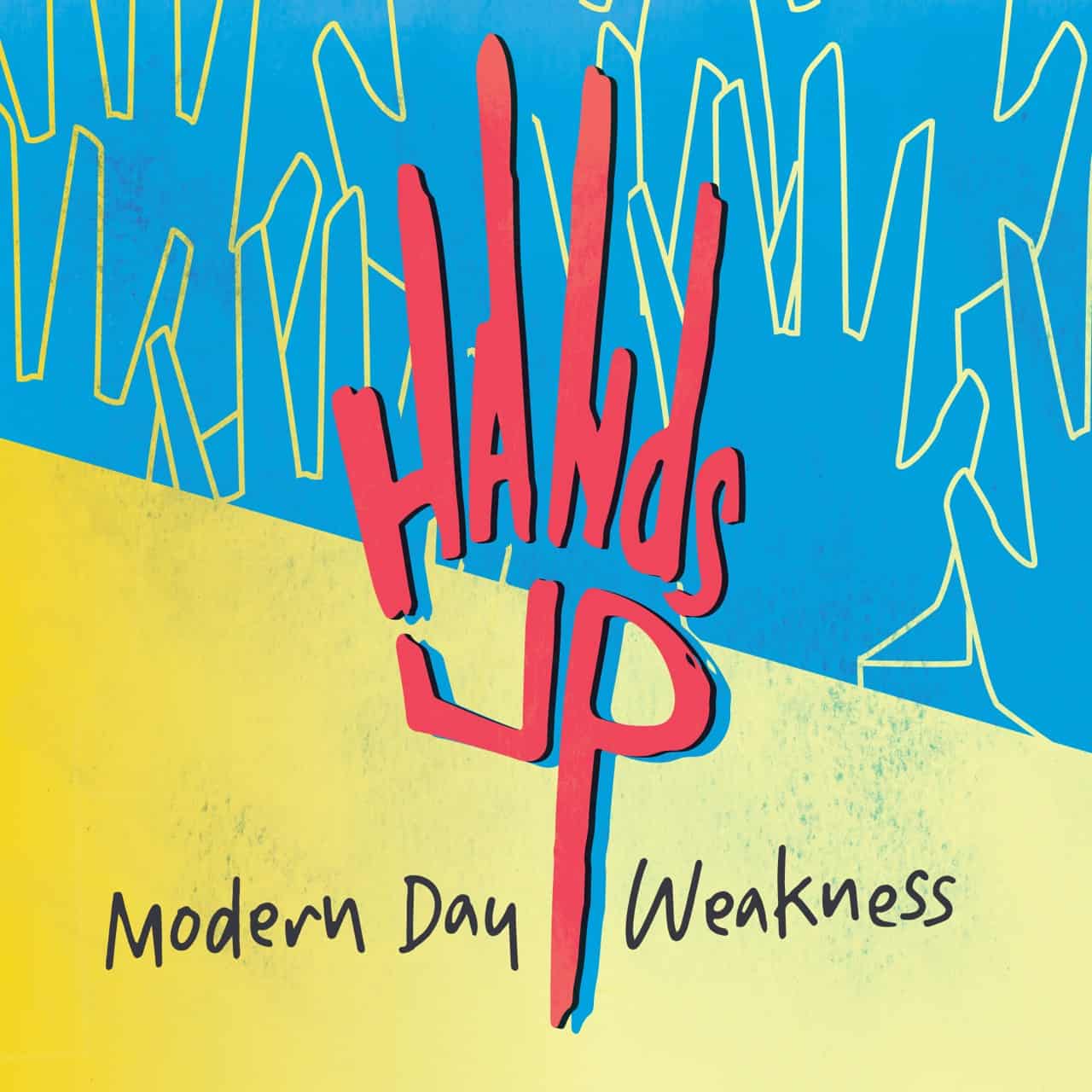
Created for Hands Up, an up and coming band who recently released their first EP, the logo needed to look fresh, modern and memorable. The band wanted a logo that played off their name and could be easily replicated across products. Stencil design played heavily in the creation of this mark.
Leaving an impression.
Logo design is the pinnacle of visual design challenges. How do you take what represents a company, product or brand and distill it into a graphic that is easy to read, appealing and has the ability to withstand changing trends?
By asking lots of questions. Then asking even more questions. And drawing, LOTS of drawing.
It is always exciting to be approached for logo design, whether it's for a personal brand or a word mark for an upcoming film. The logos and marks represented on this page are a few of my more recent pieces and show my versatility in creating solutions that are not defined by my personal style, but by the product or service I am designing for.

An 80's inspired logo I created for the upcoming independent film, Bryn Gets a Life. The film is a period piece and the logo needed to look like it was pulled out of an old school record catalog.

Personal monogram created for filmmaker C. Neil Davenport. Mr. Davenport wanted a logo with a classic, art deco aesthetic that would stand the test of time.

Created for the Christian webcomic site Cyberlight Comics, this logo was meant to invoke the feel of old school printing presses and the thick, brightly colored lines of a comic book. The exclamation point within the double "C"'s was turned into a cross to reflect the Christian-centric theme of the site's content.

Covenant Brewery, a local microbrewery startup, hired me to create a logo for their branding. They wanted a mark that had a vintage aesthetic that was reminiscent of city and sports brands. My goal was to create a mark that looked authentic and would fit in on the shelf amongst fellow alcoholic peers.

A Prequel to Bryn Gets A Life, Teddy's Party needed a similarly themed vintage looking logo. As such, I pulled from popular media at the time, in particular trapper keeper art, vintage commercials and toy ads to help craft the look and feel of the logo.

A logo design that turned into a bit of packaging, I was initially hired to create the logo for the band Aithon. The band was so happy with the mark I created that they asked me to design the packaging for their upcoming, self-titled EP.