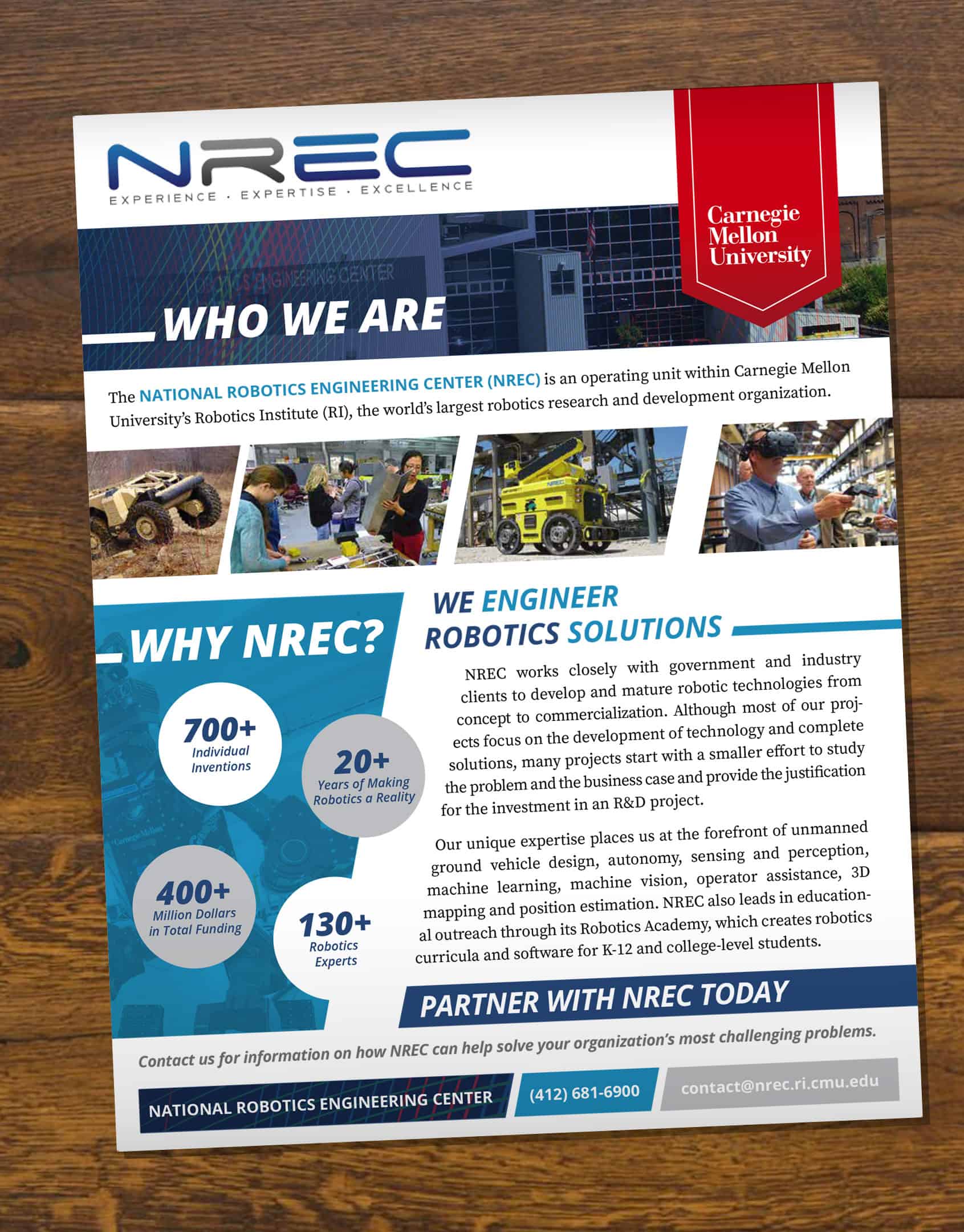
A one page, full color & full bleed partnership outreach advert designed for Carnegie Mellon University's National Robotics Engineering Center.
This ad was designed with alternating angles to subconsicoulsy invoke the feeling of forward motion to help reinfoce the fact that NREC is a leader in robotics innovation. The sole use of red was used to visually seperate and target the university logo.
Not dead yet...
I remember hearing that print was dead in the early 2000's, which is amazing, given how much of my time has been spent designing print materials. While the digital world has transformed the way people connect to one another, nothing can ever beat the tangible connection between your target audience and that beautifully designed piece in their hands.
Whether a simple brochure advertising services or product, or a well polished and embossed postcard that surprises and delights, print still hold a magic that the intangible virtual world can never rival.
Its in these wonderful print gutters that I love to create designs that guide the viewer's eye and directs them to the content they don't yet realize they need, while also upholding brand standards and creating visual excitement.
Print is like building a puzzle in reverse, with your client handing you a pile of pieces that you have to fit together in a way that is harmonious, addresses the audience and stays on message. It's a fun challenge that few things can rival.
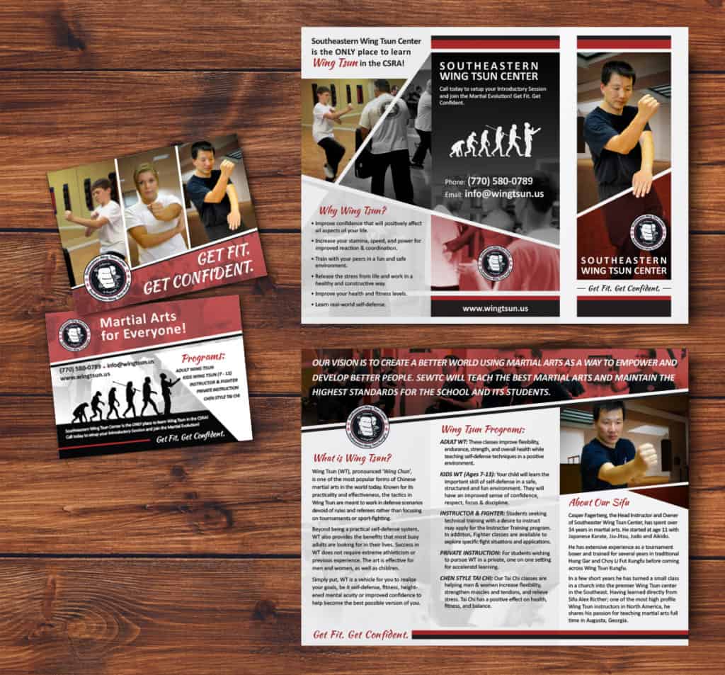
Marketing materials designed for the Southeastern Wing Tsun Center, the postcard and three panel brochure were designed to create excitement through a sense of constant visual movement. Each angle was designed to lead the viewer back to an area of interest.
Photos were selected that reflected the flow of the content, helping drive home that Wing Tsun Kung Fu is a form of martial arts centered around movement and flow.
Magazine Design
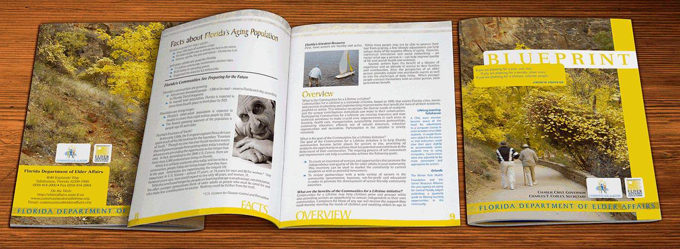
Designing a multi-page publication is a monumental challenge that takes a lot of pre-planning before ever sitting down to a computer.
For Blueprint, the Florida Department of Elder Affairs yearly publication, I started by creating a paper prototype, where I visually planned out each section, my page imposition, and even where I would use each of the photos I had been provided by the client.
This prototype became my design bible that helped me numerous times as I invariably got lost in the details of a document that averaged over twenty pages. While branding was dictated regarding color and font selection, I was able to take the constraints I was given and craft a piece that pleased the client and created a cohesive visual experience that helped educate and guide the target audience.
Realty Print Design
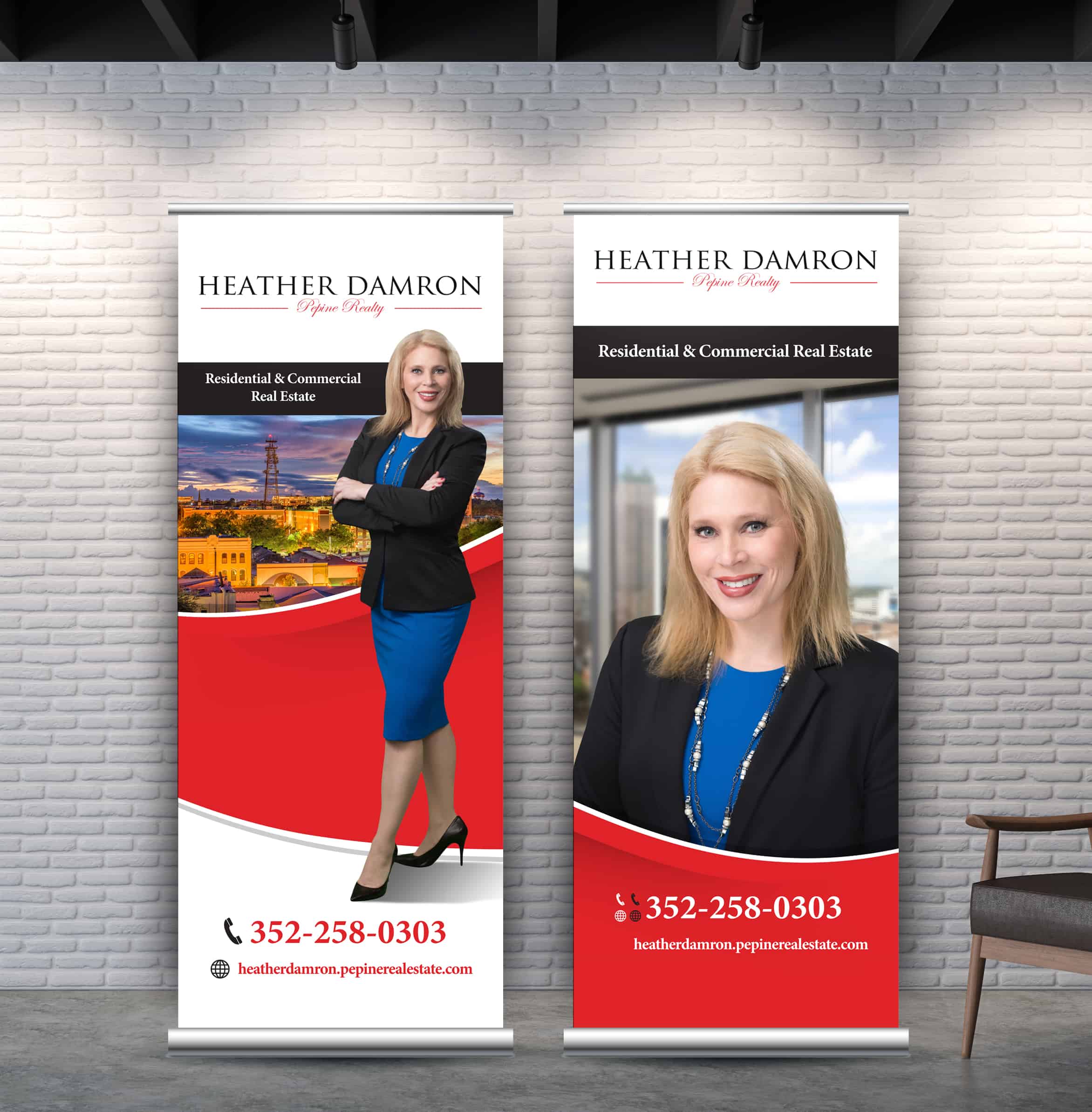
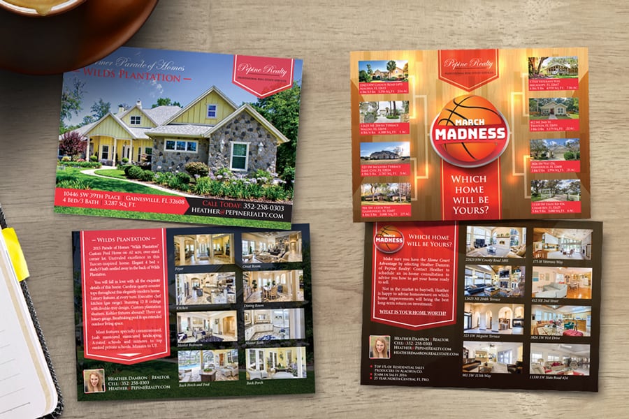
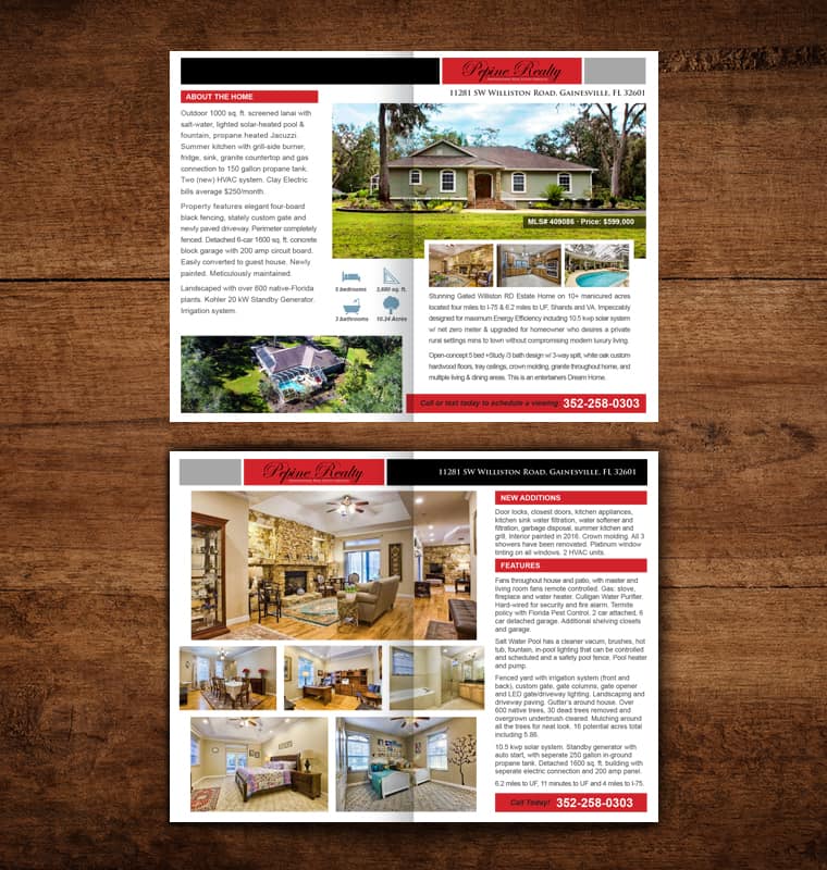
Marketing materials created for Pepine Realty. These brochures, postcards and signange required juggling multiple requirements, including a large amount of photos and copy, as well as company brand standards.
Few companies can present as many challenges as the realty industry, but the end results are also immediately tangible, with increased sales leads and home closings found after a successful marketing campaign.
Small Size, Big Impact
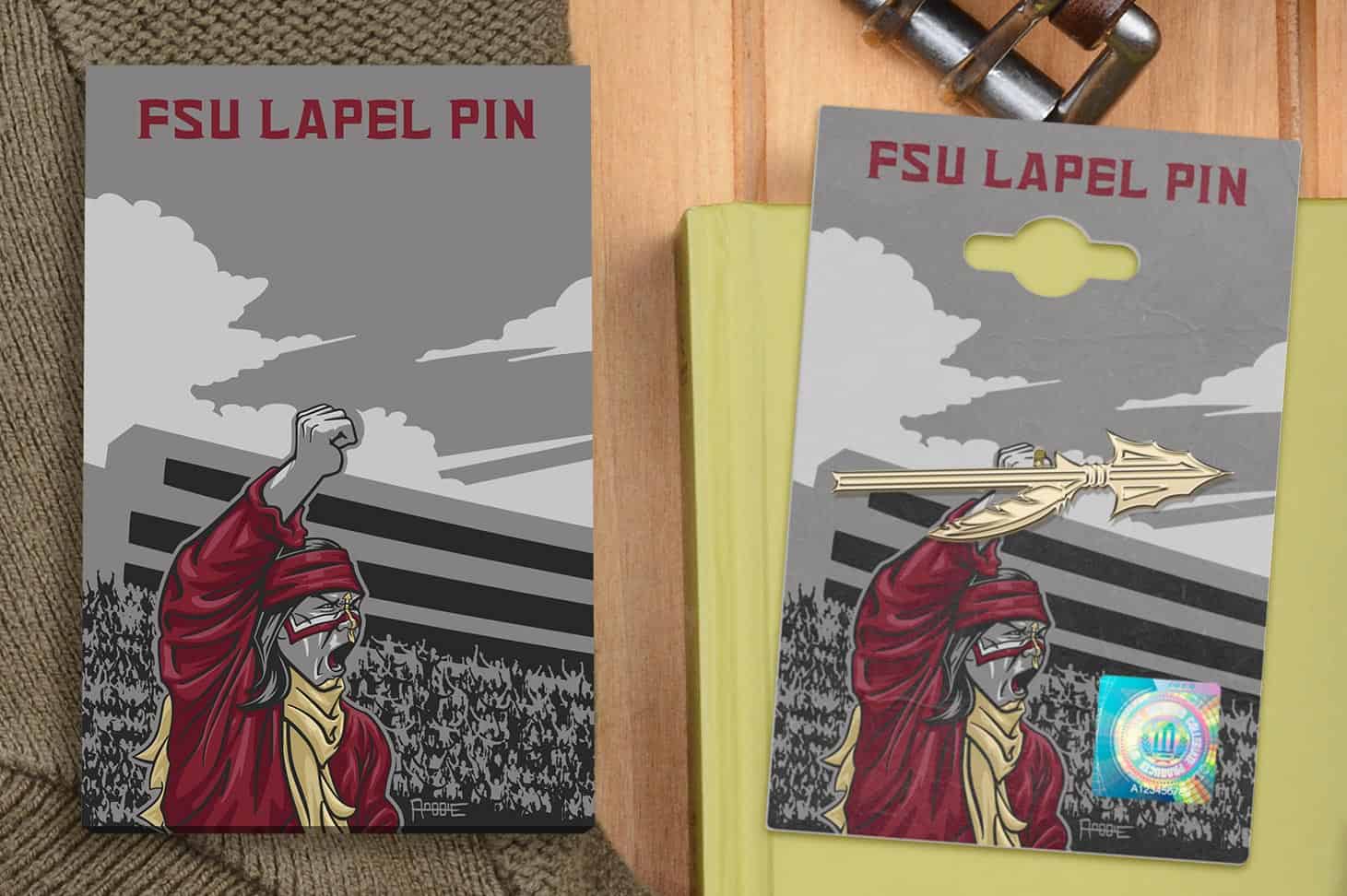
One of my favorite one-off projects, I was hired to create the packaging design for a lapel pin that was to be sold by my alma mater, Florida State University. My constraints were to use the university's approved color palette, and that the card could be no bigger than a business card.
I took the opportunity to highlight the importance of the lapel pin's iconography. The lapel pin I was designing for was that of Chief Osceola's spear, seen every game day during the fall by football fans around the country.
I created an illustration of Chief Osceola, hoisting the lapel pin in the same fashion as he lifts the real spear during opening ceremonies of every FSU home football game. I kept the text and layout minimum, given size constraints and the fact that I later found out a hologram would have to be added, but the impact was huge regardless.
Fans raved about the design and the lapel pins sold much faster than similar pins sold in the same on-campus store.
Fear the spear!
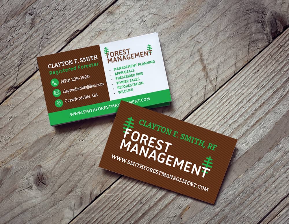
Business cards still carry extreme weight for businesses, and as such, need to reflect the voice and brand of the company as much as the website. One of my favorite pieces of late, I was hired by a forester to create iconography to accompany a business card design.
I was asked to incorporate the colors brown and green, but everything else was left to me, save the copy. I had a lot of fun using the colors to create visual content blocks to help differentiate the client's contact information from the services he offered.
Getting the opportunity to create the light hearted trees that tied into the iconography was great, as was the fact that he allowed for full bleed to really make the card pop visually.